
A little direction. A whole lot of you.
DR CV helps people turn the work they’ve done into a next step they’re ready for.
The brand should feel like someone is on your side. Green keeps our roots. Apricot brings the warmth. A turned page becomes the mark; an observant bird becomes Scout. Clear words and useful actions give all that personality a purpose.
The folded D connects the document to forward movement. The original rounded lowercase lettering is confident and approachable. Scout has a distinct bird mark and a clear DR CV endorsement.


Leave at least half the symbol’s width around each lockup. Start at 110px wide for DR CV, 130px for Scout. Use product icons below those sizes.
Use the outlined masters. Preserve proportions, the apricot fold, and Scout’s endorsement. Never rebuild the logo with live text.
Clover on light surfaces. White on forest. Ink for one-colour use. Keep text away from the character’s silhouette.
Clover is the anchor. Butter welcomes people in. Sky belongs to Scout. Apricot adds character. White carries the work.
Use forest or clover for text on light accents. Keep white text on clover or forest. Apricot and butter are personality colours; success, warning, and errors retain their own labels and semantic colours.
Schibsted Grotesk brings clean circular forms and a composed medium weight to the campaign and interface. Original drawn wordmarks give DR CV and Scout their own lettering. One readable family holds the product together.
You’ve got
good work in you.
Start with the facts. Make your contribution easier to see. Review every suggestion and decide which words sound like you.
Keep body text at 16–18px, with comfortable line spacing. Use smaller type only for brief supporting information.
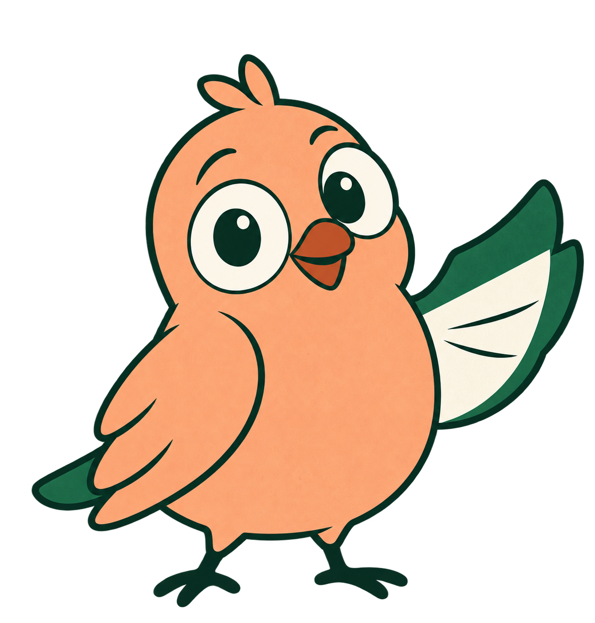
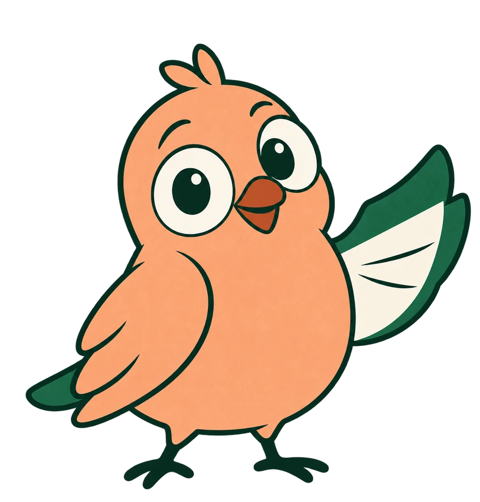
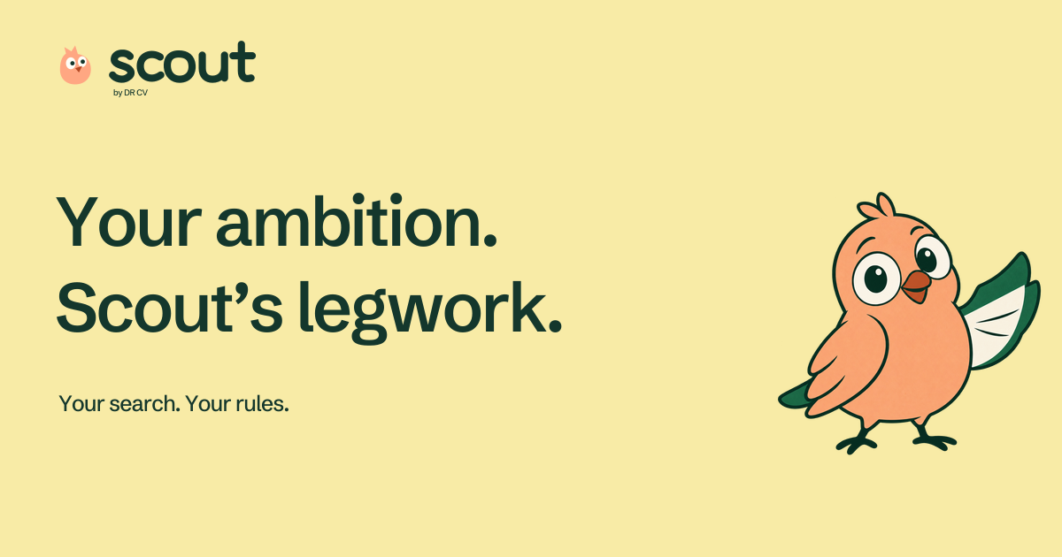
Font licenceScout spots what’s worth a closer look. The wide eyes suggest attention, the raised paper wing connects it to your CV, and its apricot body makes it recognisable beside DR CV’s green.
Use Scout to welcome, explain, and guide. Keep errors clear and factual. Celebrate completed work, and always pair the character with a useful next action.
Download Scout PNGOriginal transparent raster master, 1226 × 1283. WebP included. The simplified vector bird is for logos and small icons.
DR CV leads with your experience. Scout leads with your direction. Shared typography and green make them relatives; colour and character give each a place of its own.
Warm without being gushy. Confident without making promises. Specific enough to help someone take the next step.
Recognise the work they’ve already done. Speak plainly, and keep encouragement grounded.
“There’s good work behind your CV. Let’s bring it out.”
Controls say what happens. Empty states invite a useful first step. Errors explain how to recover.
“Add your first CV. Upload a document, paste your experience, or start fresh.”
Your facts stay yours. Unknown answers come back to you. A match and a submitted application stay distinct.
“I found a role to review. Check the fit before we move it forward.”
Campaign pages can be expressive. Workspaces should stay quieter: white documents, green actions, small character moments, clear status labels.